A Comparison of Sunshine Frequencies

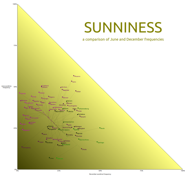
London has a reputation for being perpetually gloomy. And yet, although the frequency of sunniness in London is in fact subpar, there do exist major cities on Earth that naturally experience even less sunshine than London.

The below chart plots the frequency of sunniness in June and in December in several locations across the world. Note that sunniness requires (1) that it is daytime and (2) that there aren’t obstructing clouds. For instance, during an equinox, it’s day approximately 50% of the time, so with no clouds ever sunshine frequency during the equinox is 50%.

sunniness

Note that associated with each location is a line connecting the plotted point to a corresponding point on a central diagonal line. That corresponding point represents what frequencies would be in a city of that latitude if it was sunny 50% of the daytime, for further comparative purposes.

This chart is made with Raphael.js.

A Chain of Counties from Atlantic to Pacific, with Less than 1 Million People Total

Shown below are 74 counties that total to less than 950000 people in population (thus averaging about 12000 people per county), and yet span from the Atlantic to the Pacific. Also highlighted in a darker shade in the map are a handful of counties, any single one of which has more population than this entire chain of counties combined.

GfNIO4fI


Contents of the Chain of Sparse Population
Georgia: 13 counties totaling 176000 people
McIntosh County
Wayne County
Appling County
Jeff Davis County
Telfair County
Wilcox County
Turner County
Worth County
Mitchell County
Baker County
Calhoun County
Randolph County
Quitman County

Alabama: 7 counties totaling 130000 people
Barbour County
Pike County
Crenshaw County
Butler County
Wilcox County
Marengo County
Sumter County

Mississippi: 7 counties totaling 85000 people
Noxubee County
Winston County
Attala County
Holmes County
Humphreys County
Sharkey County
Issaquena County

Louisiana: 1 parish totaling 7000 people
East Carroll Parish

Arkansas: 8 counties totaling 121000 people
Chicot County
Ashley County
Bradley County
Calhoun County
Ouachita County
Nevada County
Hempstead County
Little River County

Oklahoma: 17 counties totaling 190000 people
McCurtain County
Pushmataha County
Atoka County
Johnston County
Marshall County
Love County
Jefferson County
Cotton County
Tillman County
Kiowa County
Greer County
Beckham County
Roger Mills County
Ellis County
Beaver County
Texas County
Cimarron County

Colorado: 7 counties totaling 36000 people
Baca County
Las Animas County
Huerfano County
Saguache County
Hinsdale County
San Juan County
Dolores County

Utah: 4 counties totaling 26000 people
San Juan County
Wayne County
Piute County
Beaver County

Nevada: 5 counties totaling 40000 people
Lincoln County
White Pine County
Eureka County
Lander County
Humboldt County

Oregon: 2 counties totaling 15000 people
Harney County
Lake County

California: 3 counties totaling 80000 people
Modoc County
Siskiyou County
Del Norte County

The 24 Most Common County Names in the United States

406 of the United States’ 3142 counties (more than 1 in 8) have one of just twenty-four names:

  • Washington
  • Jefferson
  • Franklin
  • Lincoln
  • Jackson
  • Madison
  • Clay
  • Montgomery
  • Union
  • Marion
  • Monroe
  • Wayne
  • Grant
  • Greene
  • Warren
  • Carroll
  • Polk
  • Marshall
  • Lee
  • Johnson
  • Douglas
  • Clark
  • Adams, and
  • Lake.

usa_counties_multiple

(We’re including county-equivalents as counties.)

Each of these names comes up at least 12 times among American counties; that is, for each of these 24 names, about 1 out of 4 states (or more) decided to name one of its countries this name. For the top three, that is, Washington, Jefferson, and Franklin, at least half of the states have a county named so.

In some of these cases, identically-named counties are not even very far apart: note, for instance, the closeness of Virginia’s and Tennessee’s Washington Counties, or of Minnesota’s and South Dakota’s Grant Counties.

Washington County, Oregon nearly touches Washington State, which incidentally is one of only 19 states not to have a Washington County. One may theorize this is to avoid confusion, but clearly there at least exists other states that don’t consider this confusing (as well as a county touching a state of the same name).

13 states have all three of a Washington County, a Jefferson County, and a Lincoln County; only 12 states have none of the three. The following chart demonstrates the distribution of these.

washington_jefferson_lincoln

Of the 24 most frequent county names mentioned above, 5 states have none (Delaware, Connecticut, Arizona, Alaska, and Hawaii), and 4 states have only one (Massachusetts, New Hampshire, Rhode Island, and California).

The presence of these most common county names is most prevalent in the South and Midwest, where most states are teeming with them (the three relative exceptions being South Carolina, Michigan, and North Dakota). Some particularly extreme cases include Georgia, Kentucky, Tennessee, Indiana, Illinois, Missouri, Arkansas, and Iowa, where a supermajority of these 24 names are represented.

Finally, let’s mention a county name that’s not one of the most frequent but is frequently the name of a populous county: Orange. California’s Orange County is the 6th most populous county in the United States, with over 3 million people, home to Anaheim, Santa Ana, Irvine, and other cities. Florida’s Orange County is the 34th most populous, home to Orlando. Orange County, New York is not nearly as populous as California’s or Florida’s, but is within the New York Metropolitan Area and is still fairly populous. And Orange County, North Carolina is home to Chapel Hill.

Comparative Population Density Maps of 11 Countries

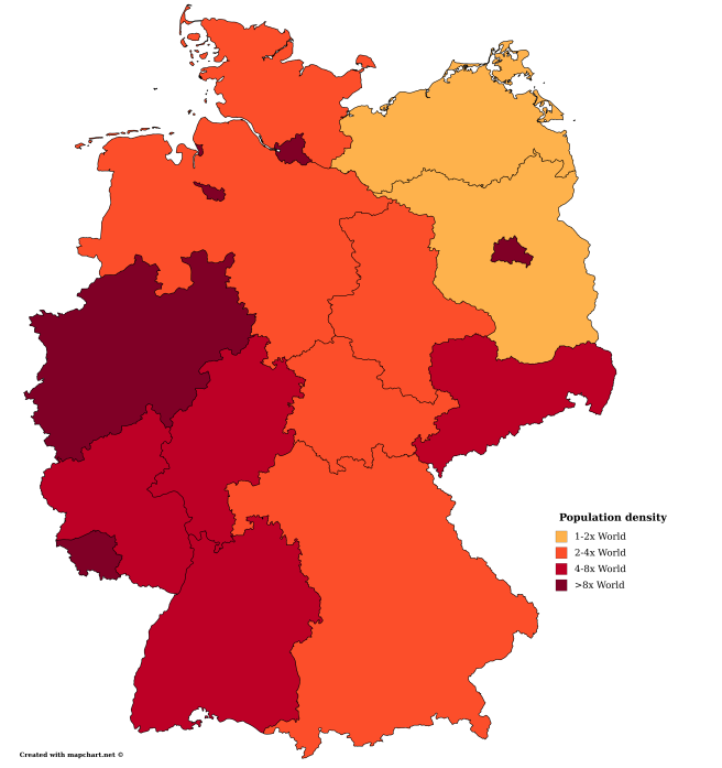
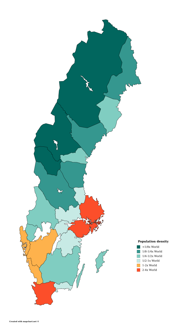
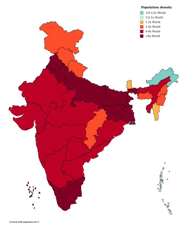
Here are maps of administrative divisions of 11 countries, colored by population density on the same density scale, to aid cross-country comparison. Rather than absolute numbers, the scale for these maps is by multiple of the population density of all the world’s land, to show whether divisions are more densely or sparsely populated than the world average: shades of red and orange for denser-than-average-populated divisions, and shades of teal for sparser-than-average-populated divisions. Note that “all the world’s land” includes Antarctica.

Australia

australia_population_density

Canada

canada_population_density

United States

us_population_density

México (Mexico)

mexico_population_density

Brasil (Brazil)

brazil_population_density

Nederland (Netherlands)

netherlands_population_density

Deutschland (Germany)

germany_population_density

Sverige (Sweden)

sweden_population_density

Россия (Russia)

russia_population_density

भारत (India)

india_population_density

中[华人民共和]国 ([People’s Republic of] China)

china_population_density

These charts are created using mapchart. Sweden’s administrative breakdown is by province rather than by county because it is the only option available on mapchart.

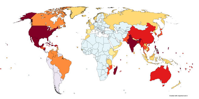
The Strongest Tropical Cyclones Each Country and US State Has Had to Deal With

Tropical cyclones are a non-problem for a large percentage of the world’s countries, but enough countries over the world do need to deal with this natural disaster that many localized names exist for this type of storm around the world: hurricane, typhoon, willy-willy.

The below charts indicate the highest-category tropical cyclone each country and each US state has experienced.

world

united_states

Birthplaces of Modern Political Figures in Asia and Neighboring Countries

asia_and_neighbors_politics_birthplaces

Note former Pakistani Prime Minister Liaquat Ali Khan was in fact born in modern-day India and former Indian Prime Minister Manmohan Singh was in fact born in modern-day Pakistan, both born before the independence and separation of the Indian and Pakistani states. Former Kazakhstani Prime Minister Sergey Tereshchenko was born way east of modern-day Kazakhstan, over in Russia’s Primorsky Krai.

Phonetic Inclusion

Here, we see whether the name of a letter is a phonetic substring of the name of another letter. For instance, in English, the pronunciation of the name of the letter B contains the name of the letter E inside it. Red arrows indicate the relation between English names of letters, blue arrows indicate the relation between français (French) names of letters, and yellow arrows indicate the relation between deutsche (German) names of letters.

phonetic

The purple arrow from E to Z is in recognition of the fact that this inclusion exists only in, for example, American English, and not in, say, British or Canadian English.

This chart is made using Graphviz.

Orthographic Inclusion

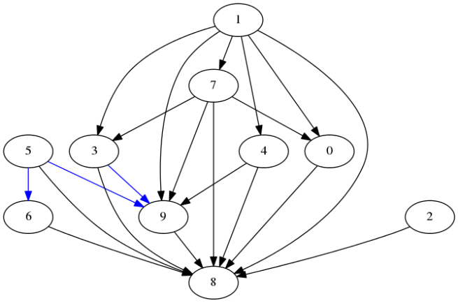
digital_numbers

In the above chart, there is an arrow from one digit to another digit if the digital font representation of the former is included in the representation of the latter. The blue arrows are relations that sometimes hold, since different designs vary in whether the top horizontal in 6 or the bottom horizontal in 9 is part of the number.

Note that assuming the digital font allows one to precisely determine whether connections exist, as opposed to simply talking of the digits themselves, for which many arguments may rise about handwriting/font and what constitutes being an orthographic subset. The next few charts involve symbols for which even the correct digital font representation is quite arguable and for which I’ll just present one of several possible inclusion graphs.

Let’s start with moving from Arabic numerals to Chinese numerals.

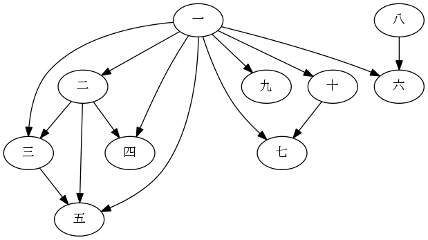
chinese_numbers

There are several debatable connections here. Should 七 (7) be considered to include 一 (1)? The stroke in the middle is often written somewhat diagonally, as is the case in the font of the graph, but still in Chinese dictionaries 七 is often placed under the section for the radical 一, so I’ll include the arrow. This is also a large part of the reason for the arrow from 八 (8) to 六 (6), being the lower two strokes. The strokes in the inside of 四 (4), though, are essentially different from the ones in 八 (8), so no arrow from 八 (8) to 四 (4). An arrow doesn’t exist from 一 (1) to 八 (8), as well, because that small horizontal segment is really just a property of the computer font and isn’t much considered to be essentially part of the character for the number.

If we want to look at larger sets of symbols, then we may want to reduce arrow clutter a bit. We can do that by recognizing that the subset relation is transitive and agreeing to understand that when we see chains of arrows we know of implied arrows between members of an arrow chain not immediately connected.

Here’s a chart for sans-serif English capital letters, assuming several things about handwriting/font choice.

sans_serif_letters

One major assumption here is that things that look sort-of like semicircles are in fact semicircles. If you wish to disagree, you could go ahead and remove, for instance, the C→S connection. Also, all diagonal strokes of the same sign of slope are assumed the same slope. In addition to these, semicircles off of straight portions are assumed to have some straight portion adjacent to the straight component they touch before heading into curvature. It is possible that with just slightly different assumptions about handwriting/font, we could have, for instance, a K→R connection.

Finally, here’s a chart for sans-serif Greek capital letters, under the same assumptions.

sans_serif_greek_letters.pngI decided I’m not going to go bother to make these charts for lowercase letters, where handwriting/font interpretation has even more degrees of freedom to consider. I’d guess, though, that the greater diversity of features makes most reasonable charts less connected than corresponding uppercase charts.

I generated these charts using Graphviz.