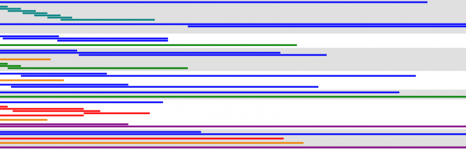
Today, I tried to produce some handwritten visualization. It came out…okay.
This is a chart of latitude in the Northern Hemisphere.
Here’s the PDF: wywing_by_hand
Today, I tried to produce some handwritten visualization. It came out…okay.
This is a chart of latitude in the Northern Hemisphere.
Here’s the PDF: wywing_by_hand
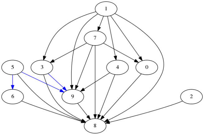
In the above chart, there is an arrow from one digit to another digit if the digital font representation of the former is included in the representation of the latter. The blue arrows are relations that sometimes hold, since different designs vary in whether the top horizontal in 6 or the bottom horizontal in 9 is part of the number.
Note that assuming the digital font allows one to precisely determine whether connections exist, as opposed to simply talking of the digits themselves, for which many arguments may rise about handwriting/font and what constitutes being an orthographic subset. The next few charts involve symbols for which even the correct digital font representation is quite arguable and for which I’ll just present one of several possible inclusion graphs.
Let’s start with moving from Arabic numerals to Chinese numerals.
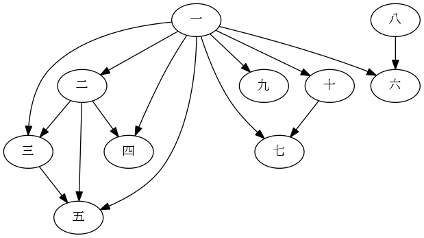
There are several debatable connections here. Should 七 (7) be considered to include 一 (1)? The stroke in the middle is often written somewhat diagonally, as is the case in the font of the graph, but still in Chinese dictionaries 七 is often placed under the section for the radical 一, so I’ll include the arrow. This is also a large part of the reason for the arrow from 八 (8) to 六 (6), being the lower two strokes. The strokes in the inside of 四 (4), though, are essentially different from the ones in 八 (8), so no arrow from 八 (8) to 四 (4). An arrow doesn’t exist from 一 (1) to 八 (8), as well, because that small horizontal segment is really just a property of the computer font and isn’t much considered to be essentially part of the character for the number.
If we want to look at larger sets of symbols, then we may want to reduce arrow clutter a bit. We can do that by recognizing that the subset relation is transitive and agreeing to understand that when we see chains of arrows we know of implied arrows between members of an arrow chain not immediately connected.
Here’s a chart for sans-serif English capital letters, assuming several things about handwriting/font choice.
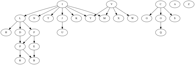
One major assumption here is that things that look sort-of like semicircles are in fact semicircles. If you wish to disagree, you could go ahead and remove, for instance, the C→S connection. Also, all diagonal strokes of the same sign of slope are assumed the same slope. In addition to these, semicircles off of straight portions are assumed to have some straight portion adjacent to the straight component they touch before heading into curvature. It is possible that with just slightly different assumptions about handwriting/font, we could have, for instance, a K→R connection.
Finally, here’s a chart for sans-serif Greek capital letters, under the same assumptions.
 I decided I’m not going to go bother to make these charts for lowercase letters, where handwriting/font interpretation has even more degrees of freedom to consider. I’d guess, though, that the greater diversity of features makes most reasonable charts less connected than corresponding uppercase charts.
I generated these charts using Graphviz.
